Therapist Website Design: What Mental Health Practices Need to Convert Visitors Into Booked Clients
Published May 22, 2026 · Last updated: May 22, 2026
What Mental Health Practices Need to Convert Visitors Into Booked Clients

- Over 60% of people searching for mental health services are on their phones.[1] A therapy website that does not work flawlessly on mobile is not a small problem. It is the primary interface breaking the relationship before it starts.
- 35% of people with a mental health condition say they do not know where to go for services.[2] Clarity about what you treat, who you help, and how to reach you is the most powerful conversion tool a therapy website has.
- The therapy website visitor is in a fundamentally different psychological state than any other healthcare website visitor. They are often anonymous, often in distress, and testing whether the space feels safe before they reveal anything about themselves. Every design decision should serve that state.
- Photos of people looking sad or distressed on a therapy website are counterproductive. The best therapy websites sell the transformation: what life looks like after therapy, not what the struggle looks like before it.[3]
- Nearly 70% of people who use digital mental health tools say it felt more comfortable than speaking with someone directly.[4] Your website is not just a marketing tool. For many prospective clients, it is the first moment of engagement with help.
A therapy practice website is unlike any other healthcare website. The visitor who lands on it is not comparison shopping in the way a dental patient evaluates implant costs or an aesthetic patient compares before-and-after results. They are doing something more vulnerable and more private: they are deciding, often in a moment of significant distress, whether they trust this specific person enough to reach out.
That decision happens in silence. The therapy website visitor does not ask questions out loud. They read, they look, and they make a judgment call about whether the person behind the website would understand them, before they reveal anything about themselves at all. And then they either send a message or they close the tab and return to their distress without help.
Understanding that psychology is the difference between a therapy website that converts and one that does not. This guide covers the seven design decisions built around what I call the Anonymous Distressed Browser: the specific psychological state of a therapy website visitor, and what their experience of your website needs to be in order to move from cautious interest to booking a consultation.
The Anonymous Distressed Browser: Understanding Who Is Actually on Your Website
Before a single design decision is made, the most important thing a therapist can do is understand the mental state of the person who will be visiting their website. In almost every other industry, the customer arrives with a relatively stable emotional baseline. They are curious, they are comparing, they are evaluating. In therapy, a significant proportion of website visitors arrive in the opposite of a stable baseline. They are anxious, uncertain, and in some cases, actively in crisis.
This is the Anonymous Distressed Browser. They have typed something into a search engine that they have never said out loud to anyone. They are on their phone, probably late at night, probably alone. They have arrived at your website without any prior relationship with you. And the first thing they are assessing, before they read your credentials, before they read your bio, before they look at your fees, is whether this website feels safe.
Safe means different things in different healthcare contexts. In a longevity clinic context, safe means clinically credible. In an aesthetic clinic context, safe means trustworthy and results-driven. In a therapy context, safe means non-judgmental, warm, and genuinely interested in them as a person rather than a case. It also means private: the therapy website visitor is carrying something they have not shared with anyone, and the visual and verbal language of your website either confirms that their experience will be held with care or suggests it will not.
This is why a therapy website that is built on the same conversion principles as an aesthetic clinic or a dental practice almost always underperforms. The principles that produce conversion in high-ticket healthcare: clinical authority signals, credential visibility, outcome specificity, are secondary at best and counterproductive at worst for the Anonymous Distressed Browser, who does not need to be convinced of your expertise before they need to feel that you understand them.
Seven Design Decisions That Convert the Anonymous Distressed Browser
The first thing a therapy website visitor reads should make them feel seen. Not a list of modalities. Not a credentials summary. A statement that names the specific experience they are having and communicates that you understand it. When you name the exact struggles your ideal clients are facing, they feel seen, and when people feel seen, they reach out.[5]
Photos of people looking sad, anxious, or distressed are counterproductive on a therapy website. They confirm the visitor's current state instead of showing them where they could be. The most effective therapy websites show the transformation: people who are calm, connected, and present. They are selling the outcome, not the problem.[3]
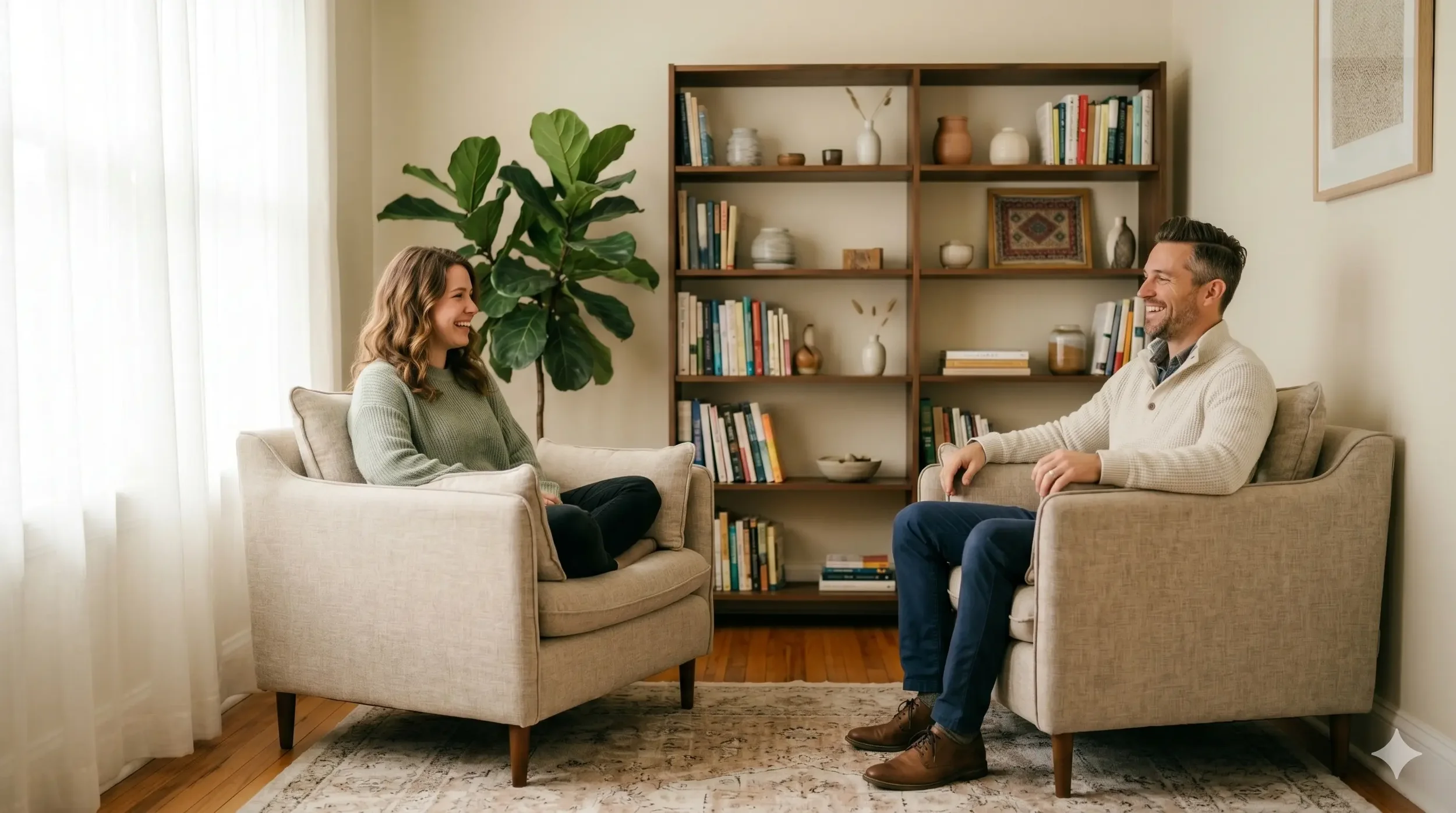
This applies equally to the imagery of your office space. A room that looks calm, warm, and genuinely comfortable communicates that the experience of being there will feel the same. The opposite of clinical, fluorescent, and sterile.
A real headshot of the actual therapist, in a real space, doing real things, does more conversion work than any amount of clever copywriting.[1] People decide whether they trust you in part by looking at your face. The Anonymous Distressed Browser is making a judgment about whether they could tell this person something they have never told anyone. They need to see your face to make that call.
The photo should be taken in or near your actual office space. It should show you in a relaxed, natural posture. It should not be a formal headshot against a plain background. It should be the kind of photo that makes a first-time visitor think "this person seems like someone I could talk to."
The copy voice of a therapy website should feel like a conversation, not a clinical document. Use first person ("I work with") and second person ("you might be feeling") to create connection. Avoid clinical detachment. The visitor is not reading for other therapists. They are reading as a person who needs help and is wondering whether you are the right person to provide it.[6]
The contact form or booking flow is the moment of highest anxiety on any therapy website. The visitor has decided they might want help and now must reveal something about themselves to a stranger. The form that converts is the one that asks for the minimum necessary to initiate contact: name, email, and optionally, a brief note. Nothing else. No detailed intake questionnaire at the first contact point. No required phone number if it is not necessary. No multi-step process that feels like an application.
Buttons should be invitational, not transactional. "Let's Connect" or "Start Here" creates less friction than "Book Now" or "Schedule Appointment" for a visitor who is not yet sure they are ready. The conversion decision has already been made by the time the visitor reaches the button. The button's job is to confirm it feels safe to proceed, not to close a sale.
Insurance, cost, session format (in-person or telehealth), and what the first session actually looks like are the questions every prospective therapy client is wondering and most are too uncertain to ask before they commit. Addressing these questions directly and transparently on the website removes the most common reason a visitor does not follow through: they cannot get the practical information they need without making a commitment they are not ready for.
A dedicated FAQ section or a "What to Expect" page that answers these questions in plain, non-clinical language significantly reduces the anxiety around the first step. It communicates that you understand the hesitation involved in reaching out, and that you have thought about what a first-time client needs in order to feel safe moving forward.
Over 60% of mental health searches happen on mobile phones.[1] The Anonymous Distressed Browser is almost always on their phone, probably in a private moment. A website that breaks on mobile, displays text that requires zooming, or has a contact form that is difficult to complete on a phone breaks the relationship at the highest-stakes moment in the journey. Every element of the therapy website, from the hero image to the contact form, must function as a primary experience on a 390px screen, not as a scaled-down version of a desktop experience.
HIPAA-Conscious Design: What Therapy Websites Must Get Right That Other Healthcare Sites Often Skip

Therapy websites carry a compliance dimension that most other healthcare websites do not face with the same acuity: every contact form, inquiry widget, and scheduling tool handles information that a person considers extremely private, and in many cases, information that is legally protected as Protected Health Information under HIPAA once a professional relationship is established.
The practical compliance guidance for therapy website design covers four specific areas:
Contact and inquiry forms. A general inquiry form asking for name and email only, before a therapeutic relationship exists, does not typically constitute a HIPAA-regulated transaction. However, any form that asks about mental health symptoms, diagnoses, or treatment history before a client relationship is established requires careful legal review. When in doubt, keep initial contact forms to the minimum: name, email, preferred contact method, and an optional free-text note field. Do not include condition-specific dropdown menus or symptom checklists on a public-facing contact form.
Scheduling software. When you integrate online booking software, verify that the platform offers a Business Associate Agreement (BAA) and is designed for HIPAA-compliant healthcare scheduling. Not all general scheduling tools offer this. SimplePractice, TherapyNotes, and Jane App are among the platforms built with this compliance layer. Generic booking tools like Calendly, while useful in other contexts, are not appropriate for therapy intake scheduling without specific HIPAA configuration.
Testimonials and case descriptions. Do not use identifiable patient experiences on your website without explicit written consent. Case descriptions, even fictionalized, carry risk if they could be identified by the patient they describe. A brief, general statement about the kinds of people you work with and the kinds of changes you support is appropriate. Specific case narratives require legal review before publication.
Privacy policy and telehealth disclosures. Your website should include a privacy policy that explains how visitor and client information is handled, a telehealth service disclosure if you offer virtual sessions, and information about your state licensure. Clients in different states may not be eligible for your services depending on your licensing, and your website should make your licensed practice states clear.
Ambrose Marketing designs therapy practice websites that balance conversion-focused design with the sensitivity and compliance requirements mental health practices require.
See Our Therapist Website Work →Frequently Asked Questions About Therapist Website Design
References
- Mojo Agency. Best Therapist Website Designs in 2026. April 5, 2026. mojo-agency.com/therapist-website-designs/
- Innerwell (citing SAMHSA, NAMI data). Mental Health Statistics 2026: Key Trends. April 2026. helloinnerwell.com/reflections/mental-health-statistics
- Master Your Message. Best Website Design for Therapists: 10 Outstanding Examples for 2026. January 2026. masteryourmessage.ca
- Bipartisan Policy Center. Survey Shows Widespread Use of Apps and Chatbots for Mental Health Support. April 2026. bipartisanpolicy.org
- Mental Health IT Solutions. 10 Quick Steps To Design A Therapist Website: 2026 Guide. January 2026. mentalhealthitsolutions.com
- TL Design Studios. Therapist Website Design: Build Trust and Book Clients in 2026. February 2026. tldesignstudios.com
Conclusion
The therapy website visitor is not a typical healthcare consumer. They arrive in a state of vulnerability that requires the website to do something different from every other healthcare practice site: before it informs, before it persuades, and before it converts, it must make the visitor feel safe.
The seven design decisions in this guide are all in service of that single goal, approached through different entry points. The headline that names their experience. The photo that shows them who they would be trusting. The copy that speaks to them as a person rather than a diagnosis. The contact form that keeps the first step small enough to take. The office imagery that communicates calm rather than clinical.
A therapy website built around the Anonymous Distressed Browser model is not less professional than one built around clinical credentials and modality lists. It is more effective at the specific job a therapy website has to do: helping someone who needs care take the first step toward receiving it. For the 35% of people with a mental health condition who do not know where to go for help,[2] your website may be the difference between taking that step and not. Build it to serve that moment.
For the design layer that sits underneath the conversion strategy, the aesthetic clinic website design guide covers the technical and structural decisions that make any healthcare website both convert and earn AI citations.
Ready to Build a Therapy Website That Converts the Clients Who Need You Most?
Book a free 15-minute strategy session. We will look at your current website against the Anonymous Distressed Browser model and identify exactly where the design is creating friction for the visitors who are ready to reach out.
Book Your Free Strategy Call →The website design strategies discussed in this post are for educational purposes. Results from implementing these strategies vary by practice, market, and execution. Therapy practice websites must comply with applicable HIPAA regulations, state licensing requirements, and mental health advertising guidelines. Contact forms and scheduling tools should be reviewed for HIPAA compliance before use. This post does not constitute legal or regulatory advice. If you or someone you know is in crisis, please contact the 988 Suicide and Crisis Lifeline by calling or texting 988.
