Healthcare Brand Identity: How to Build a Visual Brand That Patients Trust Before They Read a Word
Published May 17, 2026 · Last updated: May 17, 2026
- 88% of patients say authenticity and honesty in branding are the most important factors in earning their trust.[1] A beautiful logo without a consistent identity underneath it does not build that trust.
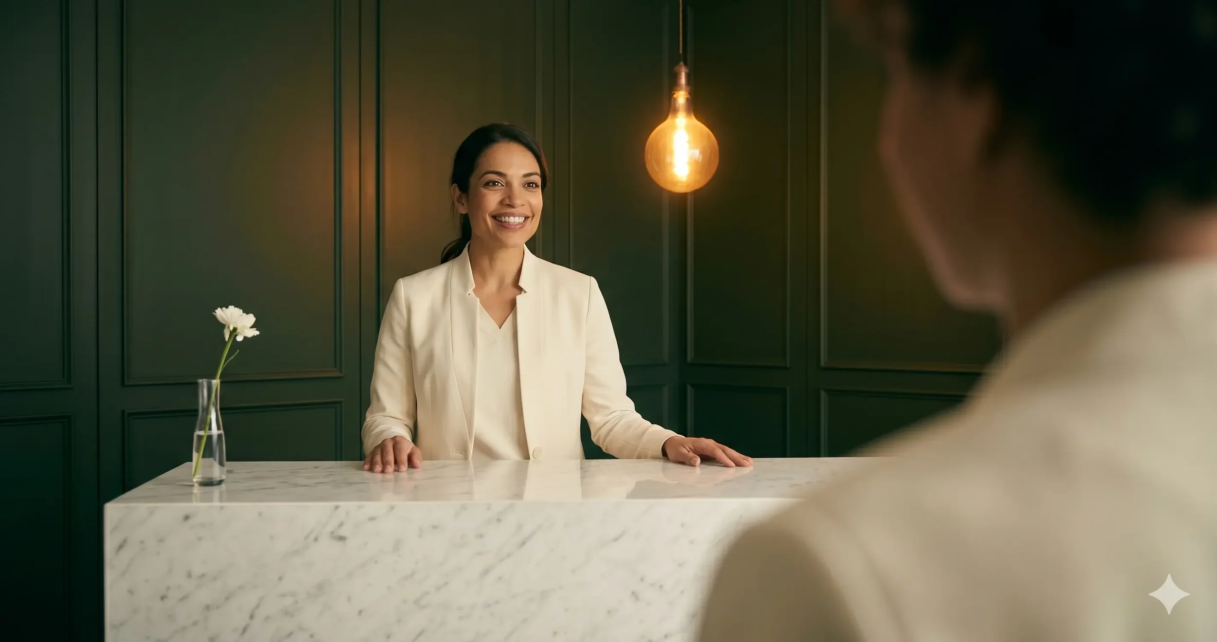
- Patients are 2-3 times more likely to trust healthcare content featuring real clinicians over branded creative alone.[2] Your providers are your brand's most valuable asset and most underused one.
- Consistent visual elements across digital and physical touchpoints increase patient trust by up to 30%.[3] Inconsistency does not just look unprofessional. It communicates unreliability.
- Healthcare branding in 2026 favors restraint over creativity. Visual identity that is subtle, professional, and credibility-focused outperforms visually bold branding in every patient trust study.[4]
- The tension every healthcare brand must resolve: being simultaneously medically credible and emotionally warm. How you resolve it depends on your specific specialty. Getting it wrong costs you patients who never tell you why they left.
A patient decides whether to trust your healthcare practice before they read a word of your copy. Before they see your Google reviews. Before they look at your credentials. The decision begins at the first visual impression, and it happens faster than a conscious thought.
This is not a soft claim. It is the mechanics of how human beings evaluate medical providers. Healthcare decisions carry higher perceived stakes than almost any other consumer decision. The brain responds to that elevated risk by pattern-matching for safety signals the moment a new stimulus appears. Your brand's visual identity is that stimulus. Whether it says "credible and trustworthy" or "generic and uncertain" is determined before the patient reads a single sentence.
What most healthcare practices get wrong is treating brand identity as a design project rather than a trust architecture project. They hire a designer to produce a logo, choose brand colors from a mood board, and call the brand done. Then they wonder why the website generates traffic without bookings, why referrals plateau, and why patients who seem interested during a consultation never actually convert.
This guide covers the Clinical-Trust Framework: the specific visual language tension that defines successful healthcare brand identity across every specialty, and the five-touchpoint audit that identifies where your current brand is losing the trust battle before a patient ever speaks to your team.
The Clinical-Trust Framework: The Tension Every Healthcare Brand Must Resolve
Every successful healthcare brand operates at the intersection of two competing signals that patients need to receive simultaneously: medical credibility and human warmth. The clinical signal tells the patient that your practice has the expertise, the training, and the rigor to be trusted with something that matters. The warmth signal tells the patient that this expertise will be delivered with empathy, that they will be seen as a person and not a case number, and that the experience of receiving care here will not be cold or transactional.
Too far toward clinical and the brand feels sterile, impersonal, and intimidating. The patient with anxiety about a procedure does not book. The patient who wants to feel cared for chooses a competitor whose brand communicates warmth more clearly, even if your clinical credentials are superior.
Too far toward warmth and the brand loses its authority signal. The practice that looks like a spa rather than a medical facility struggles to justify premium pricing. The practice whose brand communicates friendliness without clinical depth loses patients to competitors whose credentials are more visibly established.
Where on this spectrum your brand should sit depends on your specific specialty, your target patient, and what they are trusting you to do. A longevity clinic whose patients are analytical, research-oriented adults investing $6,000 in a protocol needs to sit closer to the clinical end than a wellness studio whose patients want to feel nurtured and inspired. A dental practice doing cosmetic cases needs more warmth signal than an orthopedic surgical practice. A therapist's brand needs an entirely different resolution of this tension than either of them.
The Clinical-Trust Framework is the first question every healthcare brand must answer before making a single design decision: where on this spectrum does my specific patient need me to be, and what specific visual and verbal choices create that position?
How Different Healthcare Specialties Need to Resolve the Clinical-Trust Tension

The Clinical-Trust Framework does not produce a single answer. It produces a spectrum position specific to your practice type, your patient demographic, and what they are trusting you to do. Here is how that resolves across the major healthcare and wellness specialties.
The aesthetic patient is choosing a provider they trust with their appearance. Clinical credibility matters because the result must be medically safe and expertly delivered. But the emotional register of the brand must also signal that the provider understands beauty, refinement, and the outcome the patient is hoping for, not just the clinical mechanics of delivering it.
Brands that skew too clinical (white walls, sans-serif fonts, clinical photography) look like medical facilities, not aesthetic destinations. Brands that skew too aspirational (lifestyle photography, no visible credentials, spa-like positioning) lose the trust of patients considering high-ticket treatments. The resolution: luxury editorial visual language paired with visible provider credentials and clinical specificity in copy.
Longevity clinic patients are educated, research-oriented adults who have already done significant due diligence before they reach your brand. They are not looking for warmth. They are looking for evidence that you understand the science at least as well as they do, and that your protocols are built on clinical rigor rather than trend-chasing.
Longevity brands that look like wellness brands lose patients to competitors with more clinical visual authority. The resolution is mechanism-first language, physician-authored content, protocol transparency, and a visual identity that communicates precision rather than warmth.
The therapy patient arrives with the highest baseline anxiety of any healthcare patient type. They are often considering something they have never done before, in a category they may feel stigma about, with a provider they have not yet met. Every brand signal must reduce that anxiety before any other goal is addressed.
Clinical visual language is counterproductive for therapy brands. The patient does not need to see clinical credentials before they feel safe. They need to feel that this is a non-judgmental, confidential space where their experience will be understood. The resolution is soft warmth without clinical coldness, but with enough professional grounding that the patient trusts the competence behind the empathy.
Dental patients range from anxious adults avoiding care to cosmetic patients actively seeking visible results. The brand must communicate enough clinical competence to be trusted with both groups, enough warmth to reduce the anxiety of the first group, and enough aesthetic aspiration to appeal to the cosmetic ambitions of the second.
Dental brands that look too clinical repel the anxious patient. Brands that look too spa-like lose credibility with the patient making a significant cosmetic investment. The resolution is approachable professionalism: visible warmth that does not sacrifice clinical authority.
Wellness studio patients choose their studio as much for the community identity as for the specific service. They want to feel that this practice reflects their values, their lifestyle, and the person they are working toward becoming. The brand must create that identity resonance as a primary signal, with competence as a secondary but necessary underpinning.
Wellness brands that look purely clinical lose the identity resonance that keeps studio patients loyal. Brands that lean entirely into lifestyle lose the competence signal that justifies pricing above commodity alternatives. The resolution is strong visual identity built around the aspiration the patient holds for themselves, supported by visible expertise signals.
Ambrose Marketing builds brand identities for aesthetic clinics, longevity practices, therapy studios, and wellness brands. See how we approach the Clinical-Trust Framework in practice.
See Our Healthcare Brand Work →The Five-Touchpoint Brand Audit: Where Your Brand Is Winning or Losing Patient Trust
A brand is not a logo and a color palette. It is every signal a patient receives from the moment they become aware of your practice to the moment they are sitting in your consultation room. Patients do not evaluate those signals one at a time. They form a cumulative impression across all of them simultaneously, and any significant inconsistency between touchpoints creates exactly the kind of cognitive friction that prevents booking decisions.
The five-touchpoint audit identifies where your brand is communicating consistent trust and where it is creating inconsistency that patients experience without being able to articulate it. Run this against your own practice before investing in any brand refresh.
The Four Brand Mistakes That Lose Patients Before Your Team Speaks to Anyone
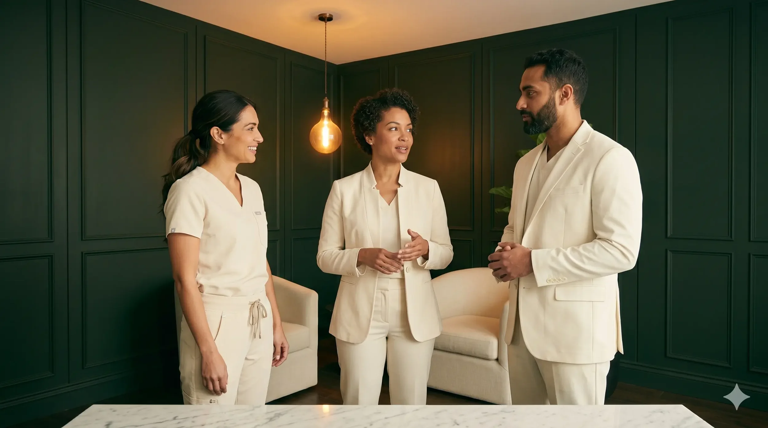
Using stock photography where real photography should be. This is the most widespread brand mistake in healthcare and the one with the most immediate impact on patient trust. 88% of patients say authenticity is the most important factor in earning their trust.[1] Stock photography of generic smiling medical professionals communicates the opposite of authenticity. It signals that the practice has not invested in making its actual team visible, which patients read as a lack of pride in or commitment to that team. In healthcare, where the decision to book is a decision to trust a specific person in a specific environment, invisibility is a competitive disadvantage.
Mismatching the brand's visual language to the specialty. A longevity clinic with a spa-like brand loses patients to a competitor with clinical visual authority, even if its protocols are superior. A therapy practice with a sterile clinical visual language loses patients to a competitor whose brand feels emotionally safe, even if its therapists are equally qualified. The brand must match what the specific patient needs to feel before they trust. Applying generic "healthcare branding" to any specialty without calibrating for the specific patient psychology is the most common root cause of brand underperformance.
Inconsistency across digital and physical touchpoints. A beautifully designed website that leads to a generic clinical environment breaks the brand promise at the highest-stakes moment in the patient journey. Consistent visual and experiential identity across all touchpoints increases patient trust by up to 30%.[3] Inconsistency does the inverse. It signals that the brand is a marketing exercise rather than a genuine reflection of the practice's identity and values.
Prioritizing visual trend over trust architecture. Healthcare branding in 2026 favors restraint over creativity.[4] Practices that chase visual trends often produce beautiful brands that underperform on trust conversion because the trend aesthetic was built for a different industry and a different patient psychology. The right question is never "what looks good?" The right question is "what builds trust for my specific patient at this specific moment in their decision?"
Frequently Asked Questions About Healthcare Brand Identity
References
- Brenton Way (citing consumer trust survey). Healthcare Branding: Complete Guide for 2026. brentonway.com/blog/healthcare-branding-guide
- Healthcare Success (citing Healthcare Success 2026 benchmarks). 2026 Healthcare Marketing Predictions: AI, Access & Trust. January 2026. healthcaresuccess.com
- Wolfable (citing healthcare branding study). Building a Clinic Brand Identity: Strategies Beyond the Logo. February 2026. wolfable.com/building-clinic-brand-identity-beyond-logo/
- Innovational Marketing. Top Healthcare and Medical Website Design Companies in 2026. February 2026. innovational-marketing.com/healthcare-website-design-trends/
- Innovational Marketing. Healthcare Branding Strategies That Build Patient Trust. March 2026. innovational-marketing.com/healthcare-branding-strategies/
Conclusion
Brand identity is not the last thing on a healthcare practice's marketing checklist. It is the first thing patients evaluate, and it determines whether every other marketing investment you make converts or evaporates.
The Clinical-Trust Framework gives you a way to think about that evaluation that is specific to your specialty and your patient rather than generic to healthcare as a whole. A longevity clinic owner and a therapist are both building healthcare brands, but their patients need completely different things from those brands before they will trust enough to book. Getting that calibration right is more important than the specific colors, fonts, or visual style you choose.
Run the five-touchpoint audit on your current brand this week. Start with the touchpoint where the gap between what you intend and what a first-time patient actually experiences is largest. That gap is where your brand is losing the patients who never tell you why they did not book. Closing it does not require a full rebrand. It requires understanding which signal is failing and making a deliberate decision to fix it.
If you want to see how this works for practices in your specific specialty, our aesthetic clinic website design guide covers the visual design layer in depth for the aesthetic market specifically.
Ready to Build a Brand That Patients Trust Before You Say a Word?
Book a free 15-minute strategy session. We will look at your current brand against the Clinical-Trust Framework for your specific specialty and identify exactly where the trust gap is.
Book Your Free Strategy Call →The branding strategies discussed in this post are for educational purposes. Results from implementing these strategies vary by practice, market, specialty, and execution. This post does not constitute legal, regulatory, or compliance advice.
